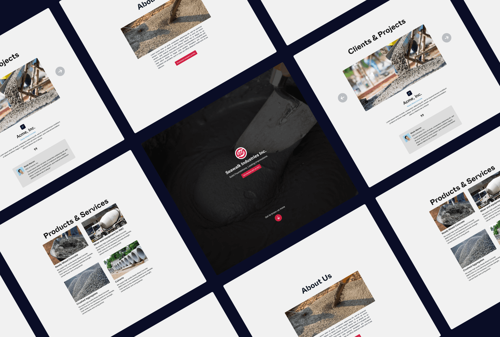
Back to Home
Showcasing the Technology and Services behind the success of Seawalk Industries Inc.
This project shows my approach in designing the landing page for Seawalk Industries.
Seawalk Industries Inc. is a leading construction materials supplier based in Cebu. They specialize in providing a comprehensive range of materials and services for concrete production. Their business also includes high-quality concrete, crushed aggregates, and culverts. Additionally, they provide essential equipment such as concrete mixers and other machinery necessary for Ready-Mix Concrete (RMC) operations.
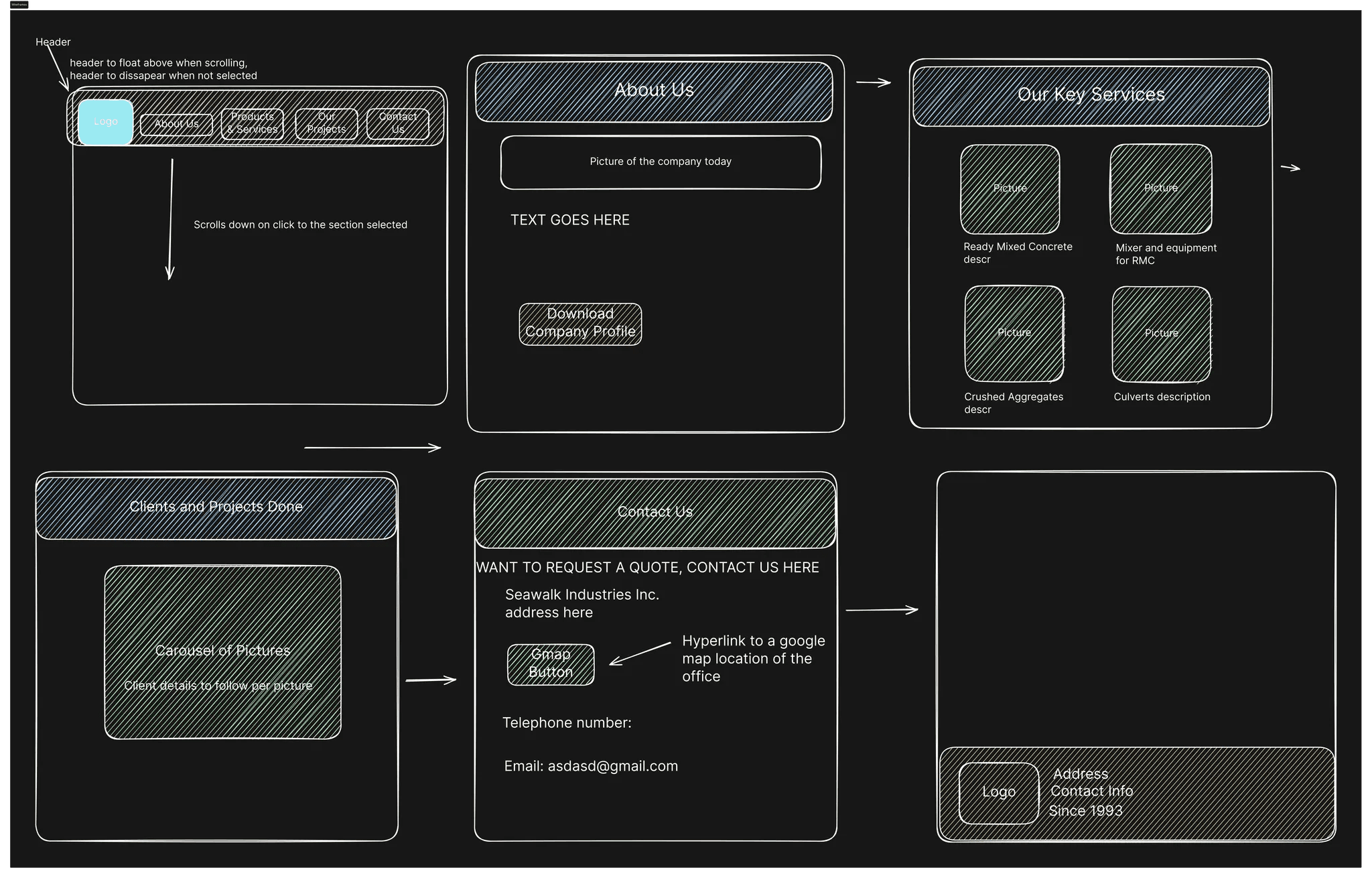
For this project, the client provided an initial wireframe outlining the site's design. This significantly sped up the design process for me, as I did not need to develop multiple layouts for the landing page.
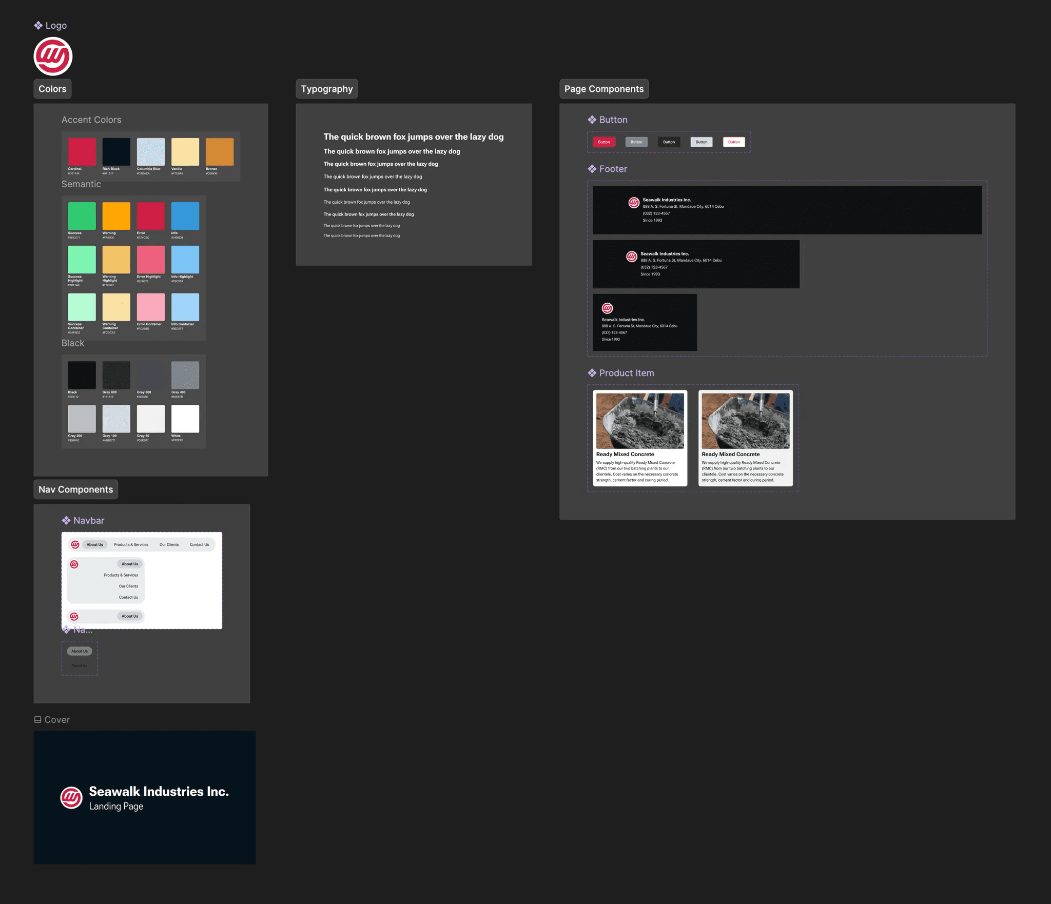
Following the atomic design approach, I began with the fundamental elements, including typography, colors, and spacing.
In setting up the typography, I established various sizes and weights for both heading and body texts. This approach proved invaluable, considering the multitude of hierarchical elements present in a landing page. Utilizing different text sizes allows for effective highlighting of specific sections, enhancing the overall readability and user experience.
When selecting colors, I primarily utilized the branding color as the main accent throughout the design. While landing pages typically don't heavily rely on semantic colors like error, warning, and success colors, I still ensured they were available for consistency. Additionally, I incorporated eight shades of neutral colors, ranging from the darkest black to the lightest white. Neutral colors play a crucial role in establishing content hierarchy, contributing to the overall clarity and organization of the page.
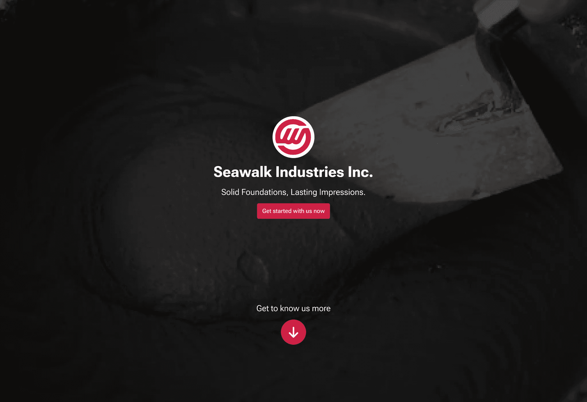
On the landing page, visitors are welcomed by the hero section, strategically designed to encapsulate the essence of the entire business brand. I aimed for simplicity in this section, prominently featuring elements such as the logo, tagline, and navbar to create a cohesive brand experience.
Furthermore, the hero section incorporates a single, compelling call-to-action (CTA) button strategically positioned to attract visitors and encourage them to engage with the business. Upon clicking this button, visitors are seamlessly directed to the contact us section, facilitating easy communication and potential business partnerships.
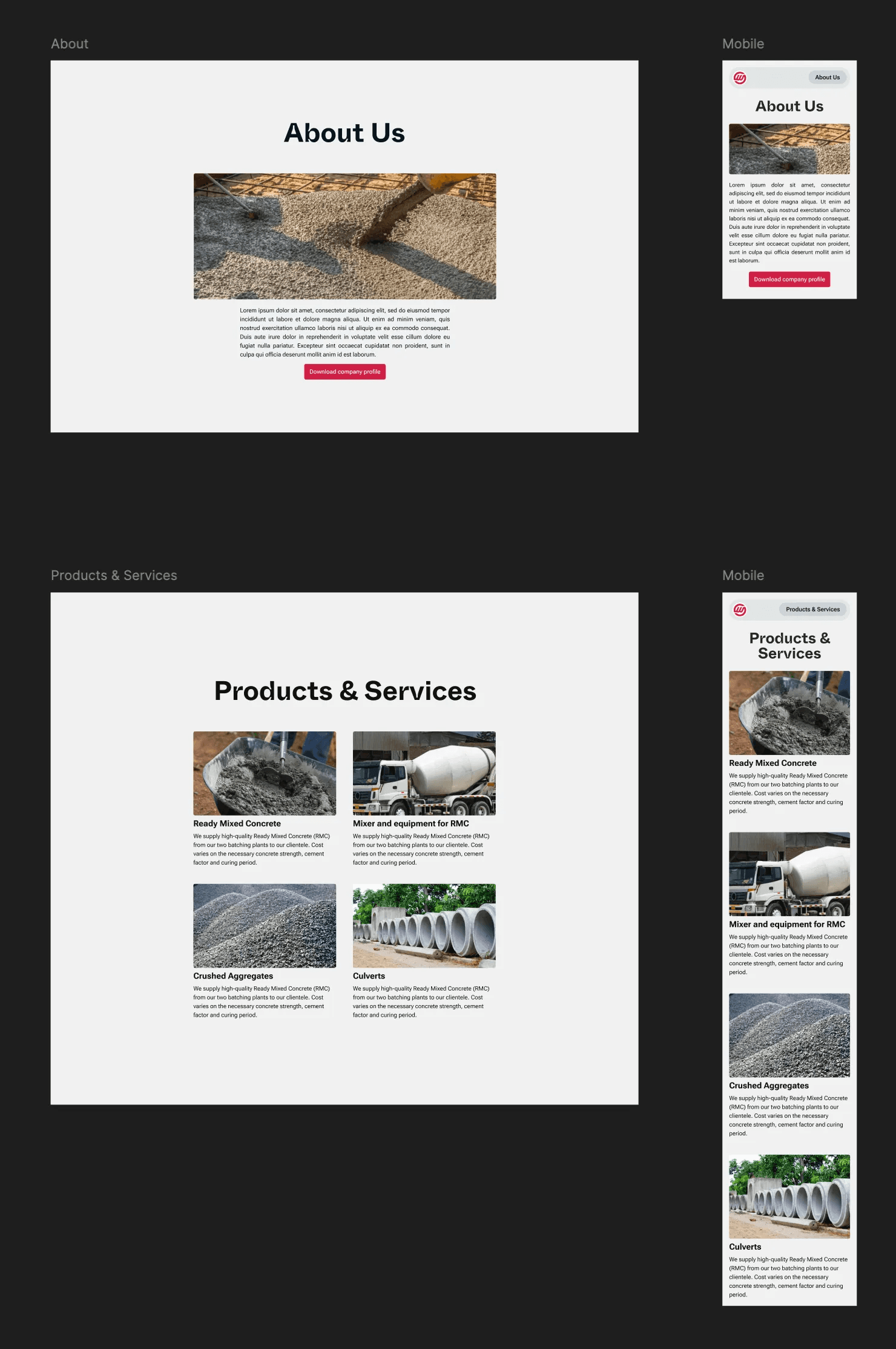
In the subsequent sections, namely "About" and "Products and Services," we maintain a simple yet effective layout. Through the strategic use of images, text, and grids, we ensure that information is presented clearly and in an organized fashion. These sections aim to provide visitors with comprehensive insights into our company's background, values, and the range of products and services we offer.
In the "Clients and Projects" section, we showcase notable previous clients and projects undertaken by the company. To enhance user experience, I implemented a carousel element, allowing visitors to seamlessly navigate through a selection of past clients and explore detailed information about each project. This interactive feature provides valuable insight into the company's track record and highlights its successful collaborations.

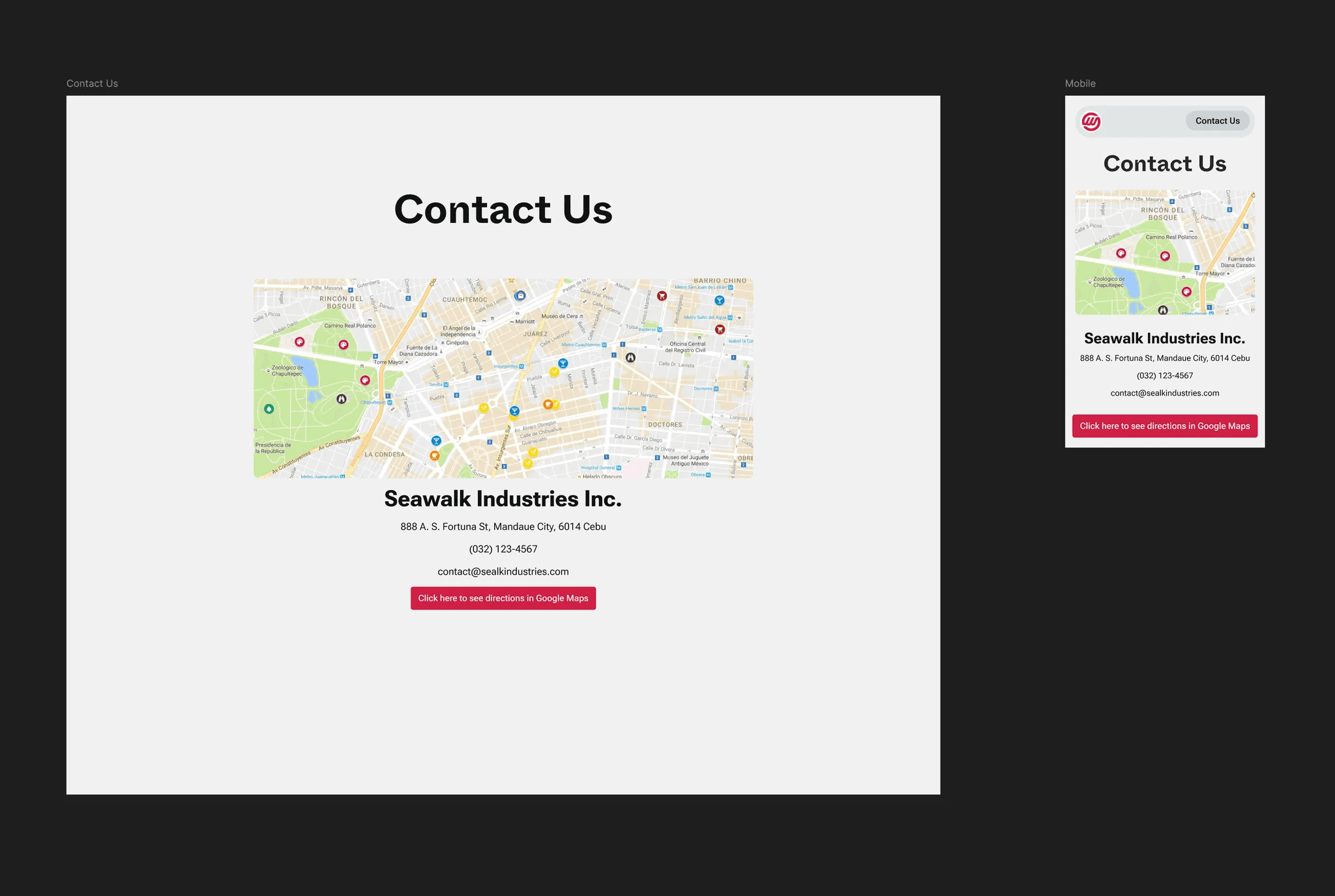
Finally, in the "Contact Us" section, I integrated a map displaying the company's office location, along with comprehensive contact details including a phone number. This ensures that potential clients have easy access to means of communication, enabling them to reach out at their convenience.
In essence, the primary objective of the landing page is to effectively showcase the company's offerings and facilitate connections with potential customers and clients. By providing comprehensive information and seamless navigation, the website aims to enhance the company's visibility and accessibility to its target audience.